
Pure//Accelerate 2024
Pure//Accelerate is Pure Storage's flagship annual conference, bringing together customers, partners, developers, IT leaders, and industry experts to explore the latest innovations in data storage, cloud infrastructure, AI, and enterprise technology.
Challenge
Create a flexible visual system that unified marketing, keynote presentations, environmental graphics, digital experiences, and event collateral under a single brand expression. The design system had to be scalable, adaptable to rapidly changing content, and consistent across cross-functional teams while delivering a premium, immersive conference experience.
Design needs to have a cohesive event identity that could scale across hundreds of digital and physical touch-points while serving diverse audiences, including customers, partners, executives, and employees.
My Role
As part of the in-house design team, I contributed to the design and execution of branded marketing and event assets, collaborating with cross-functional teams to create a cohesive visual experience across digital, print, presentations, and environmental graphics while maintaining brand consistency at scale.
Design Decisions
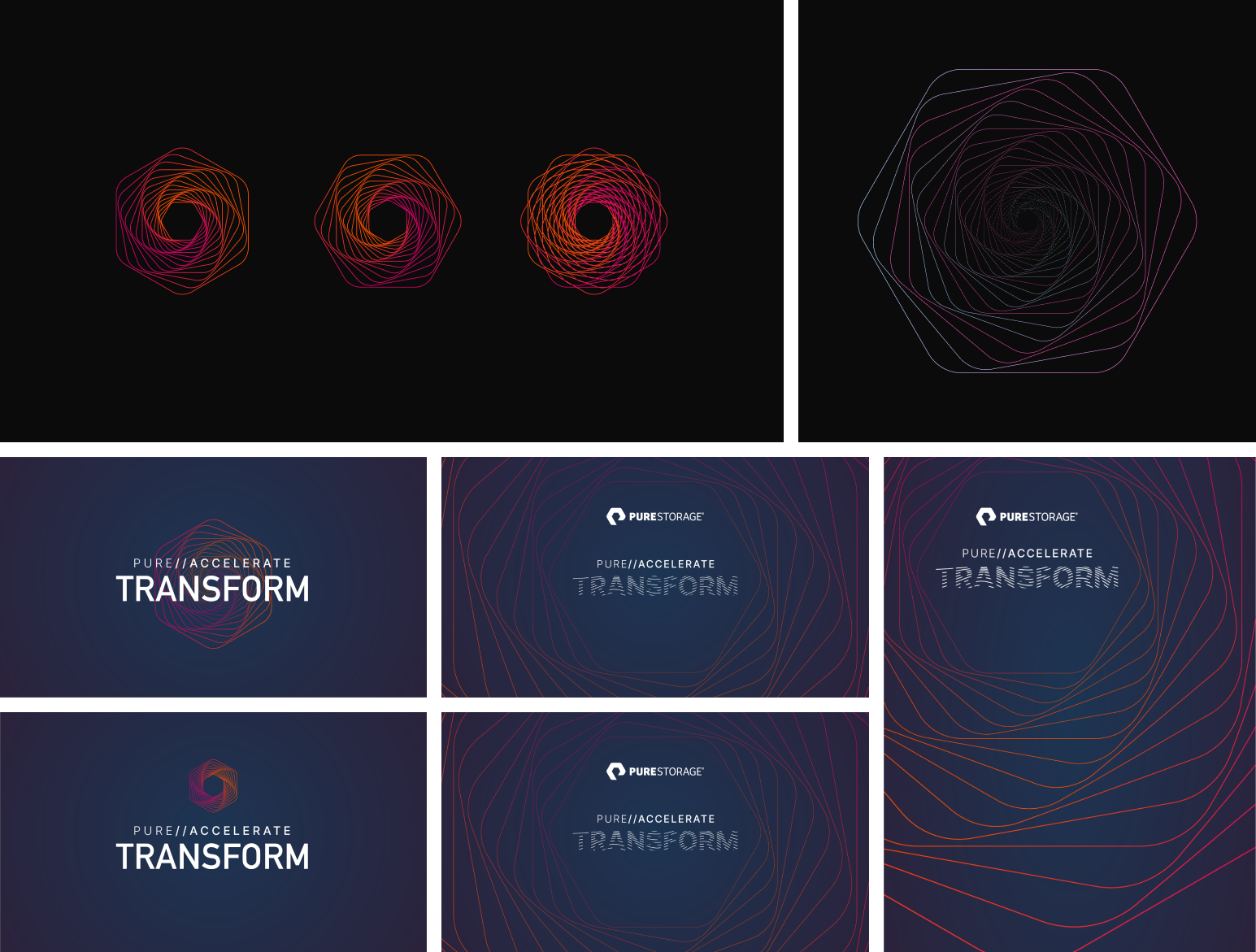
With the event initially centered around the theme of digital transformation, my initial exploration focused on reimagining the hexagon, an iconic shape deeply rooted in Pure Storage's brand identity and its heritage as a data storage company. Rather than treating the hexagon as a static graphic element, I explored transforming it into a dynamic spiral form enhanced with gradients and fluid movement.
The concept was intended to symbolize the evolution of technology and data: a visual language that blended the precision and structure of technology with the fluidity and adaptability of organic forms. The spiral suggested continuous motion, growth, and transformation, while the gradient palette reinforced a sense of energy, progress, and innovation.
Although the direction successfully captured the theme of digital transformation, it ultimately felt more conceptual than scalable. As the project evolved, it became clear that the visual identity needed to extend beyond a single graphic motif and function as a flexible system that could support hundreds of assets across digital, environmental, presentation, and print applications. That insight ultimately led us to develop a more modular design system rooted in the Pure Storage logo and its signature "//" design language, providing a stronger foundation for consistency, scalability, and long-term reuse while still preserving the energy and momentum established in the initial concept.
Preliminary concept and exploration
Final design
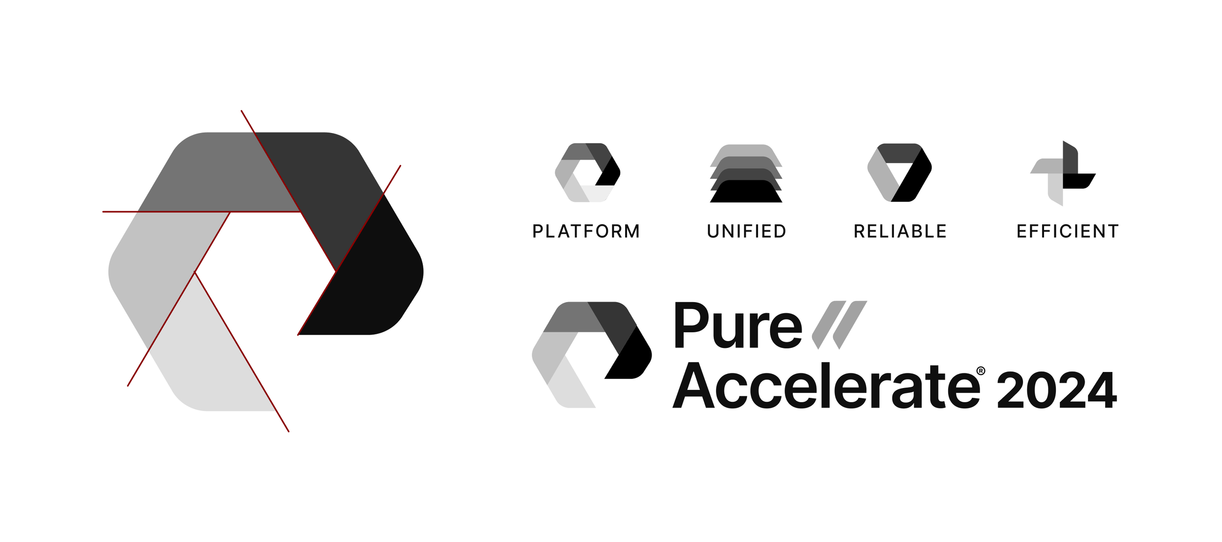
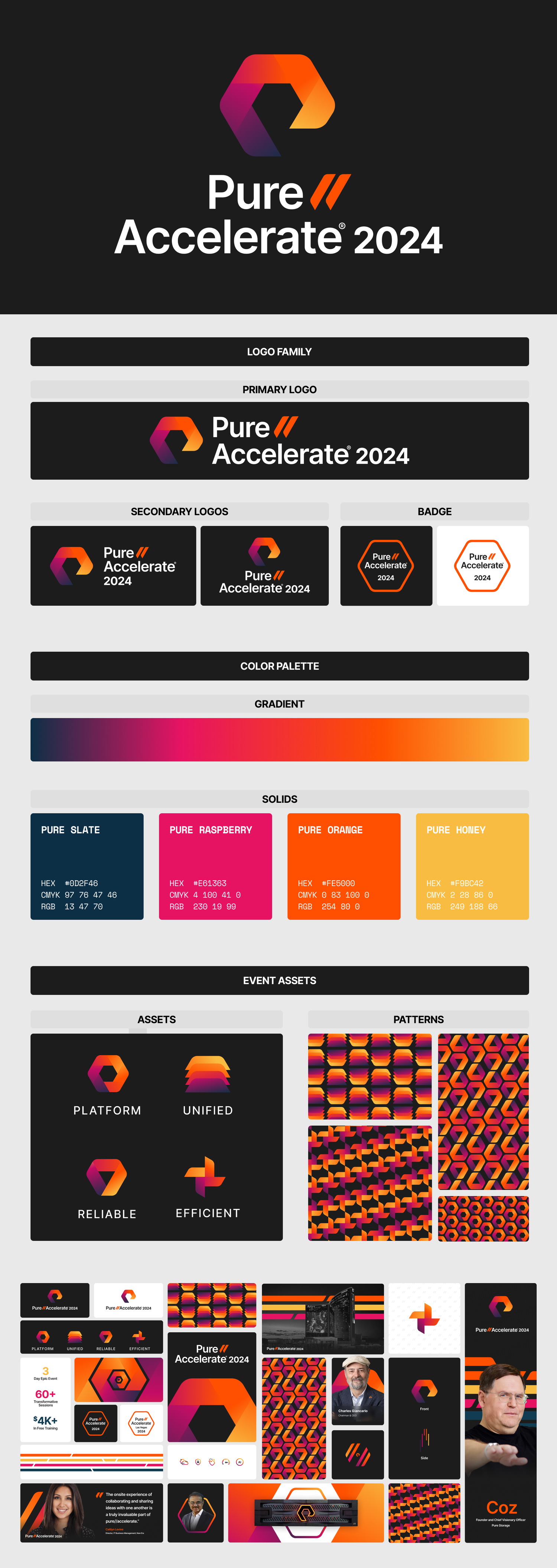
Ultimately, the visual identity evolved into a modular design system rooted in the Pure Storage logo and an expressive use of the signature "//" (slashes), a design convention already established across the company's product portfolio. We anchored the system with Pure's iconic orange while incorporating dynamic gradients to preserve the energy, momentum, and premium feel of the flagship event.
This modular approach enabled us to build a cohesive library of reusable components and templates that could be applied across a wide range of event touchpoints, from digital experiences and presentations to environmental graphics, signage, social media, and print collateral. By designing for flexibility from the outset, the system remained scalable and easy to adapt, allowing multiple teams to create new assets efficiently while maintaining a consistent and recognizable brand experience throughout the event.
Impact
Overall, the design was a success because it established a flexible visual system that could scale seamlessly across a wide range of touch-points, including digital marketing, environmental graphics, presentations, signage, social media, and print collateral. Rather than creating one-off assets, we focused on building a reusable framework of design components that enabled the team to produce new materials efficiently while maintaining a cohesive brand experience.
The system was intentionally designed to be adaptable beyond the flagship event, allowing it to be reused for future iterations as well as regional events with minimal redesign. This approach reduced production time, ensured visual consistency across teams and channels, and gave stakeholders the flexibility to tailor content without compromising the overall creative vision.
Most importantly, the design captured the excitement and momentum of the event while remaining unmistakably aligned with the brand. By balancing consistency with flexibility, we created an experience that felt energetic, immersive, and memorable for attendees, while also providing a scalable foundation that could continue to evolve as the event and brand grew.