THE JOURNEY OF SHARED MOBILITY BEGINS
Joining the company at an early stage, I participated in the development and creation of how Avail showed up in the market by establishing a visual identity that resonates with our audience using data from market and product research. This project involves diving deep into to the creation of a new brand from team building, brand strategy, positioning, and identity. Working cross-functionally throughout the entire company from business operations, design, and marketing.
WHAT IS AVAIL?
Avail is a peer-to-peer ride sharing platform and service partnered and protected with Allstate. Avail envisions mobility for all by redefining how people use cars to move and aims to reduce the cost of car ownership for Americans by matching owners of underused vehicles with individuals looking to borrow convenient, affordable vehicles.


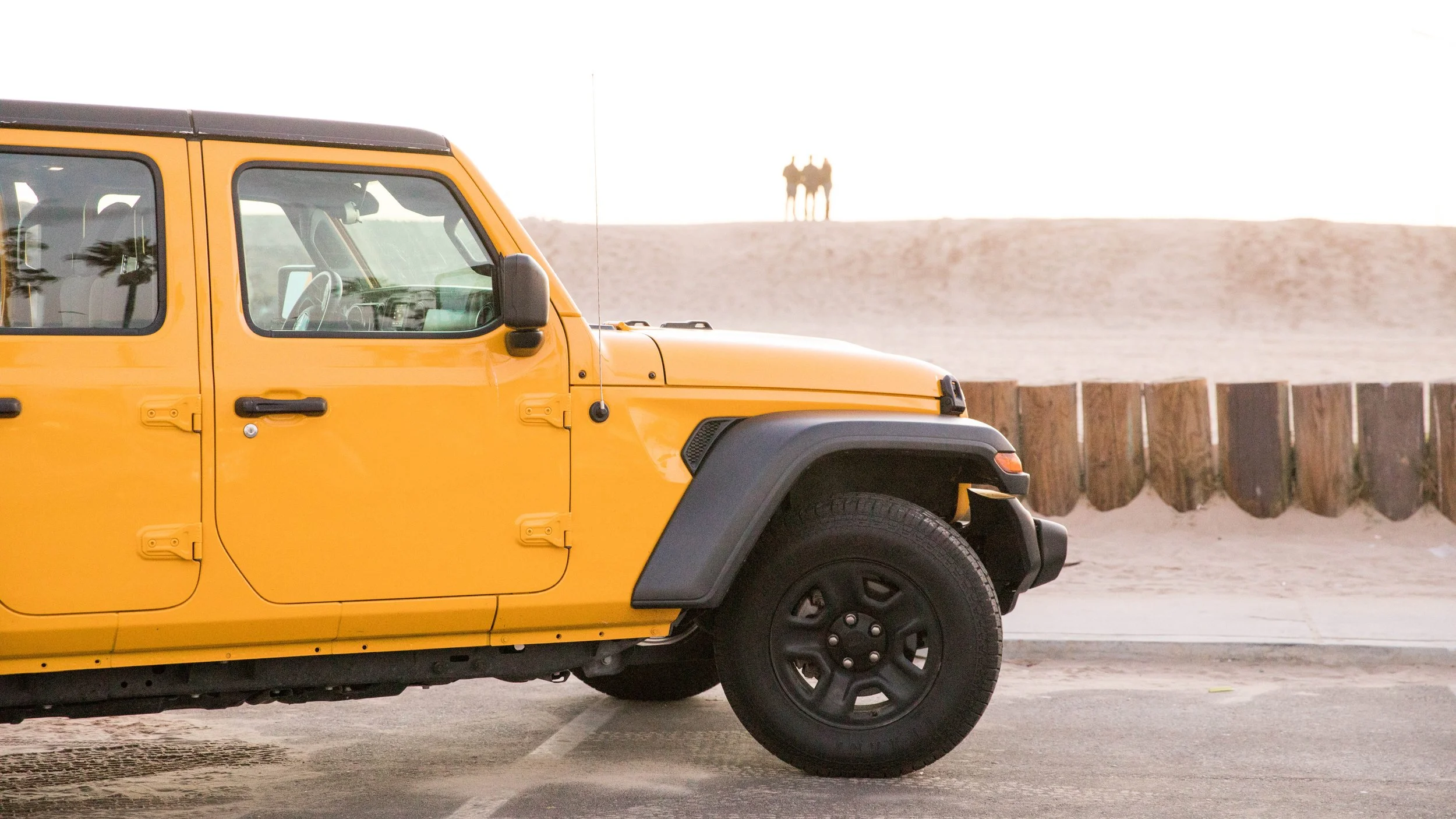



At our core, we’re all explorers and pioneers – excited about finding new places, trying new things, and redefining the way people understand mobility…and our country. Avail empowers people to move freely, providing simple, safe, shared transportation with personal service that anticipates what they’ll need on the go.
EXPLORERS & pioneers
Avail Values

BEING GOOD TO EACH OTHER
Treat people with genuine warmth and generosity. We make and support personal connections by reflecting and caring for the people, cars and places in which we do business. If we lead by example, the Avail community will follow in how they interact with one another, share each other’s vehicles and navigate the communities where they live or visit.
KEEPING IT SIMPLE
We strive to be direct and transparent, using conversational language and a direct approach so our customers feel welcomed, seen and heard. Our goal is to be simple, clear and easy to understand in every touchpoint—from customer service to product design.
WORKING TOGETHER
We’re all working together in this collective new endeavor. The most successful milestones at Avail are things we can share with our partners and customers. We always ask ourselves: How can this decision raise the tide to lift all boats? We aim to share more to better our community through transparency, service, and innovation.
BRAND PERSONALITY



WELCOMING
We are always inviting new people into our community. We have an approachable optimism in a world where we are all connected by what we share.
SINCERE
We say what we mean and do what we say we will. We are down-to-earth, loyal and honest. When mistakes happen, we own them and remedy them because we care about people.
VIBRANT
Our brand is fresh, energetic and always looking for the best ideas. We see genuine possibilities around every corner.
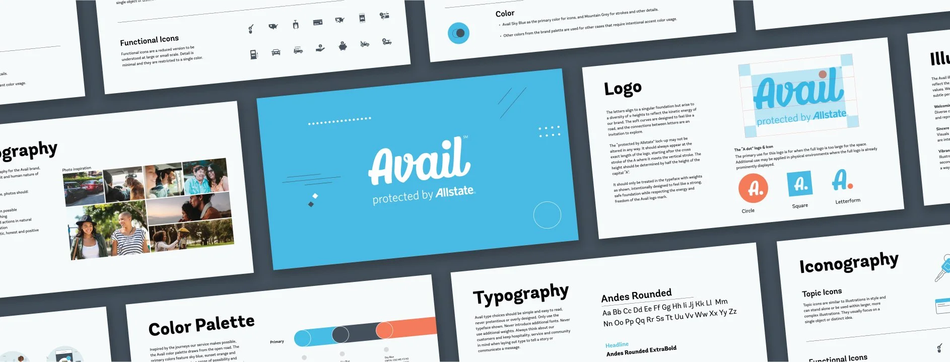
foundation
The open road,
designed.
Avail's identity draws from the freedom of travel — soft curves that move like a road, a palette pulled from sky and sunset, and a voice that's welcoming, sincere, and vibrant.
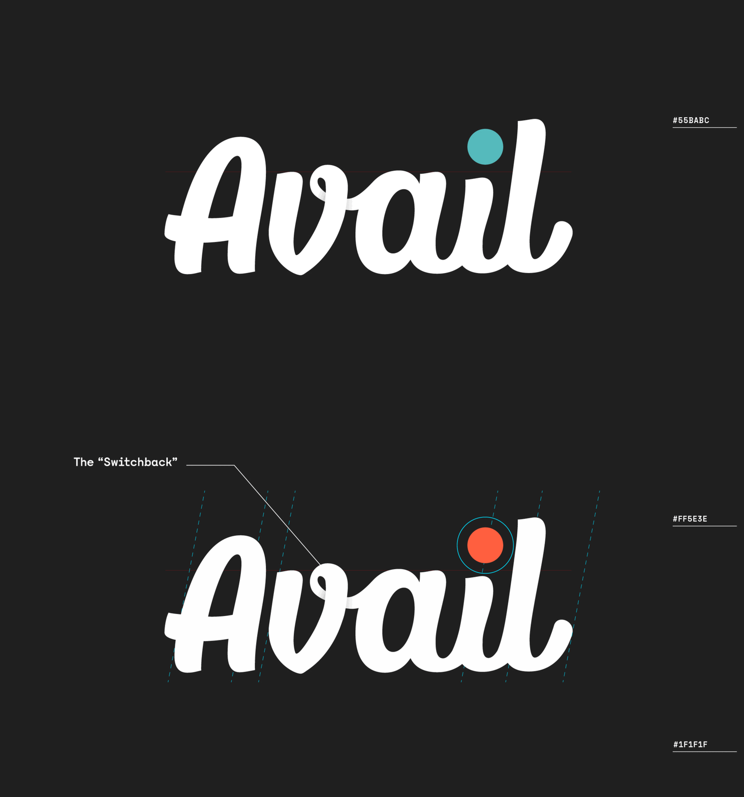
01 — Logo
A mark built
on a strong foundation.
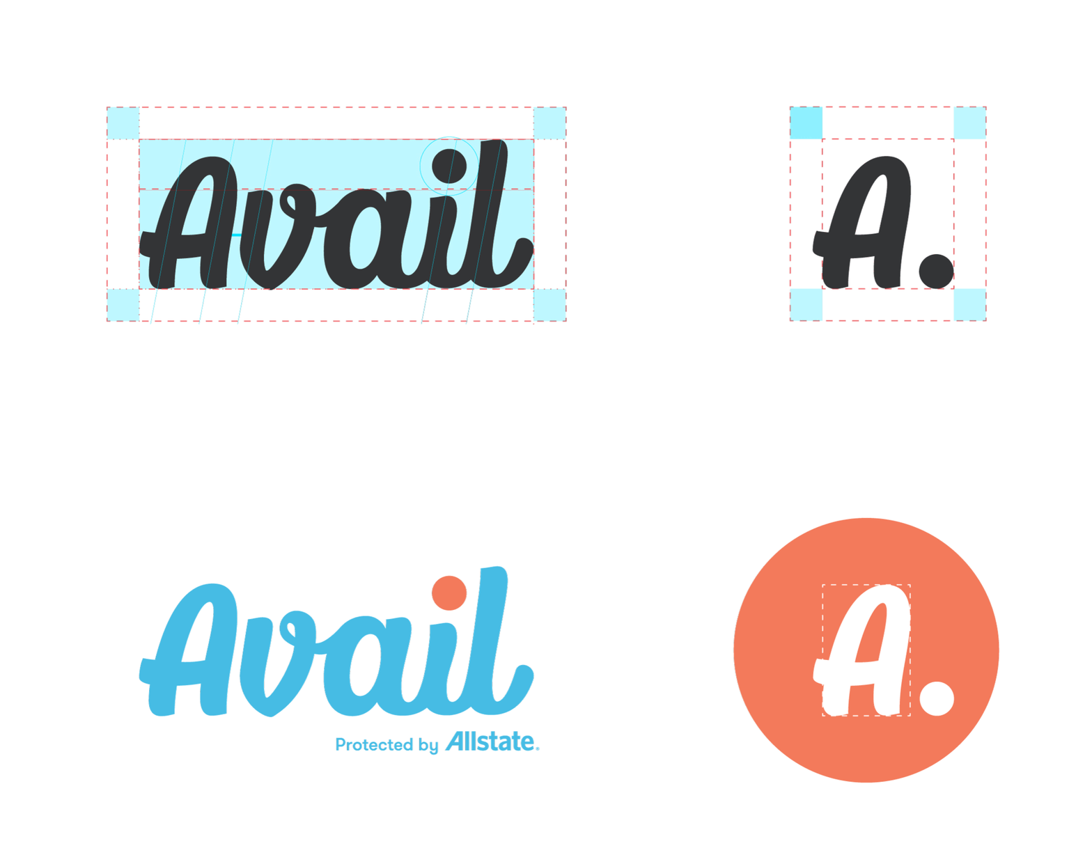
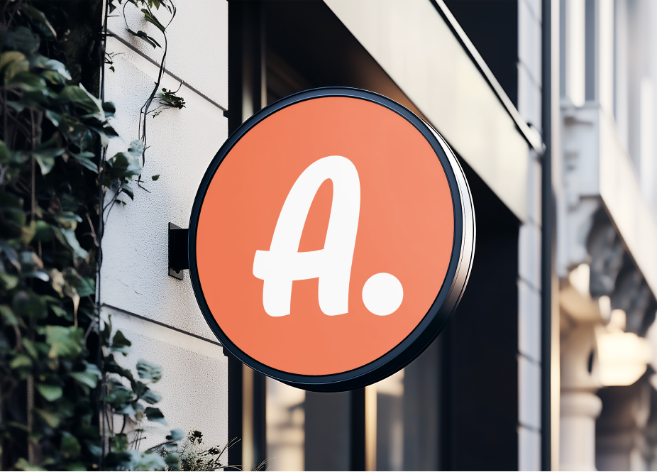
The letters align to a singular foundation but arise to a diversity of x-heights, reflecting the kinetic energy of the brand. Soft curves feel like a road; the connections between letters are an invitation to explore.
The mark should only be treated in the typeface shown — intentionally designed to feel like a strong, safe foundation while respecting the energy and freedom of the wordmark.
02 — typography
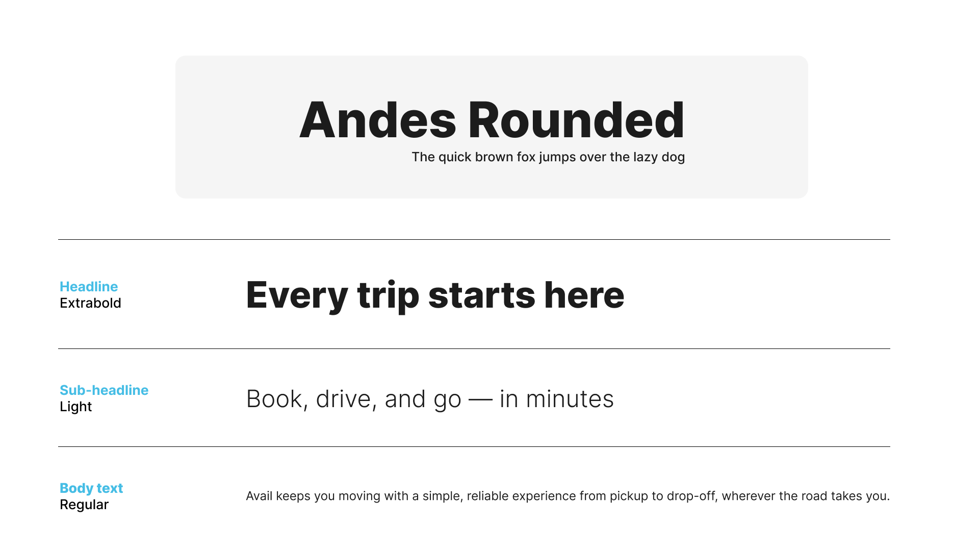
One typeface.
Three jobs.
Avail type choices are simple and easy to read — never pretentious or overly designed. Only the specified weights are used: no additional fonts, no additional weights. Every layout should keep hospitality, service, and community in mind.
03 — color
Colors of
the open road.
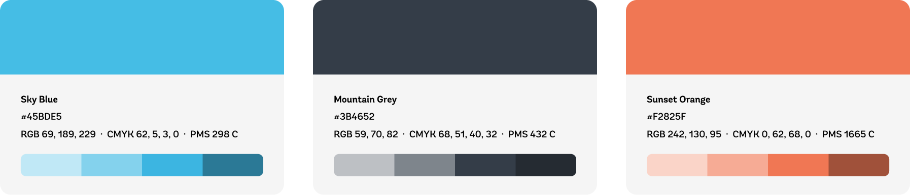
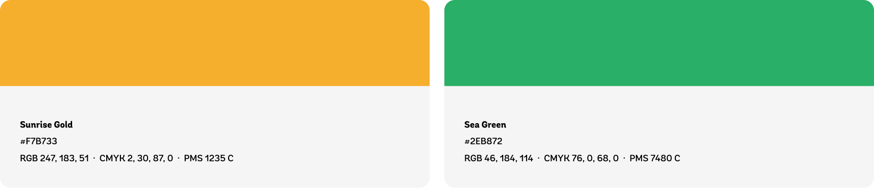
Inspired by the journeys our service makes possible, the palette draws from sky, road, and horizon. Primary colors: sky blue, mountain grey, and sunset orange — create a sense of possibility and freedom. Secondary colors: sunrise gold and sea green — provide fresh, optimistic highlights and accents.
Tints and shades are permitted for illustration and data visualization, used sparingly compared to the core brand colors.
Primary
Secondary
04 — Illustration
Flat, with a
sense of motion.
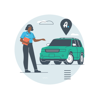
The illustration system reflects the brand's voice, vision, and values — flat 2D scenes with subtle perspective shifts on select objects, built entirely from the brand palette.
Welcoming
Diverse character designs embrace inclusivity and representation.
Sincere
Visuals are clear and easy to understand. Objects are interesting without feeling overly designed.
Vibrant
Illustrations further expand the color palette with secondary colors and skins tones. Lines are used in a way that creates a sense of movement.
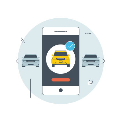

Location & travel
Booking & confirmation
People in motion
05 — Iconography
Two systems,
one language.
Topic icons echo the illustration style and can stand alone or nest inside larger scenes — each focused on a single object or idea. Functional icons are a reduced, single-color version built for legibility at any scale.
Topic Icons
Two-tone, full color, used for feature highlights and marketing moments.
Functional Icons
Single-color line marks for navigation, controls, and small UI moments.











06 — in use
The system,
together.
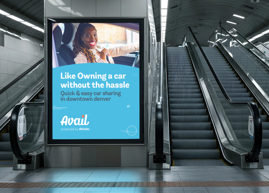
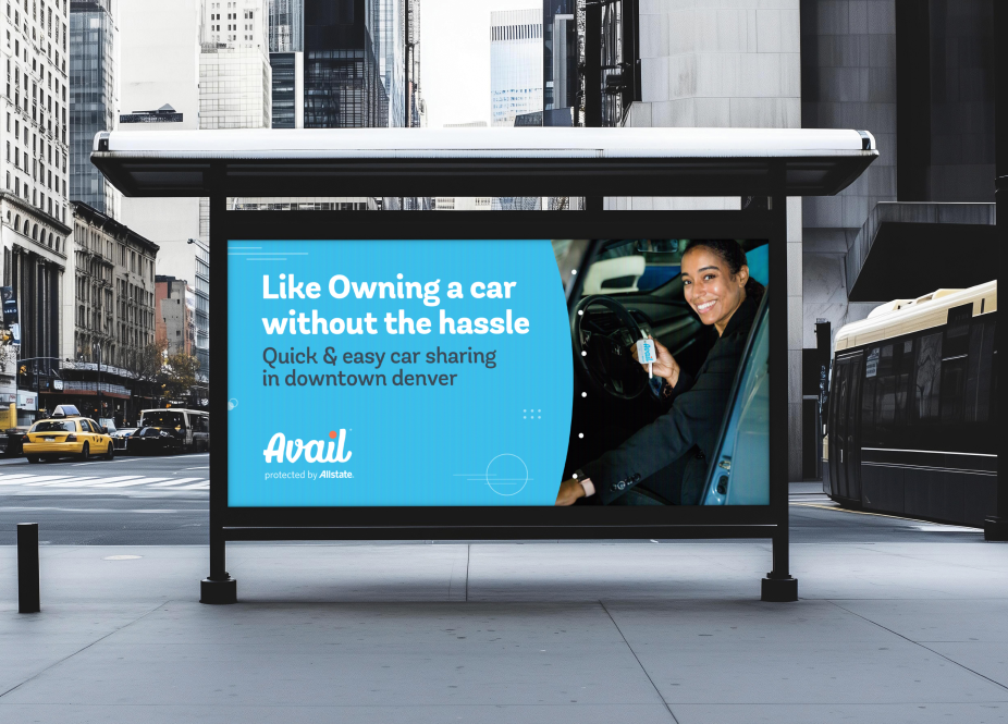
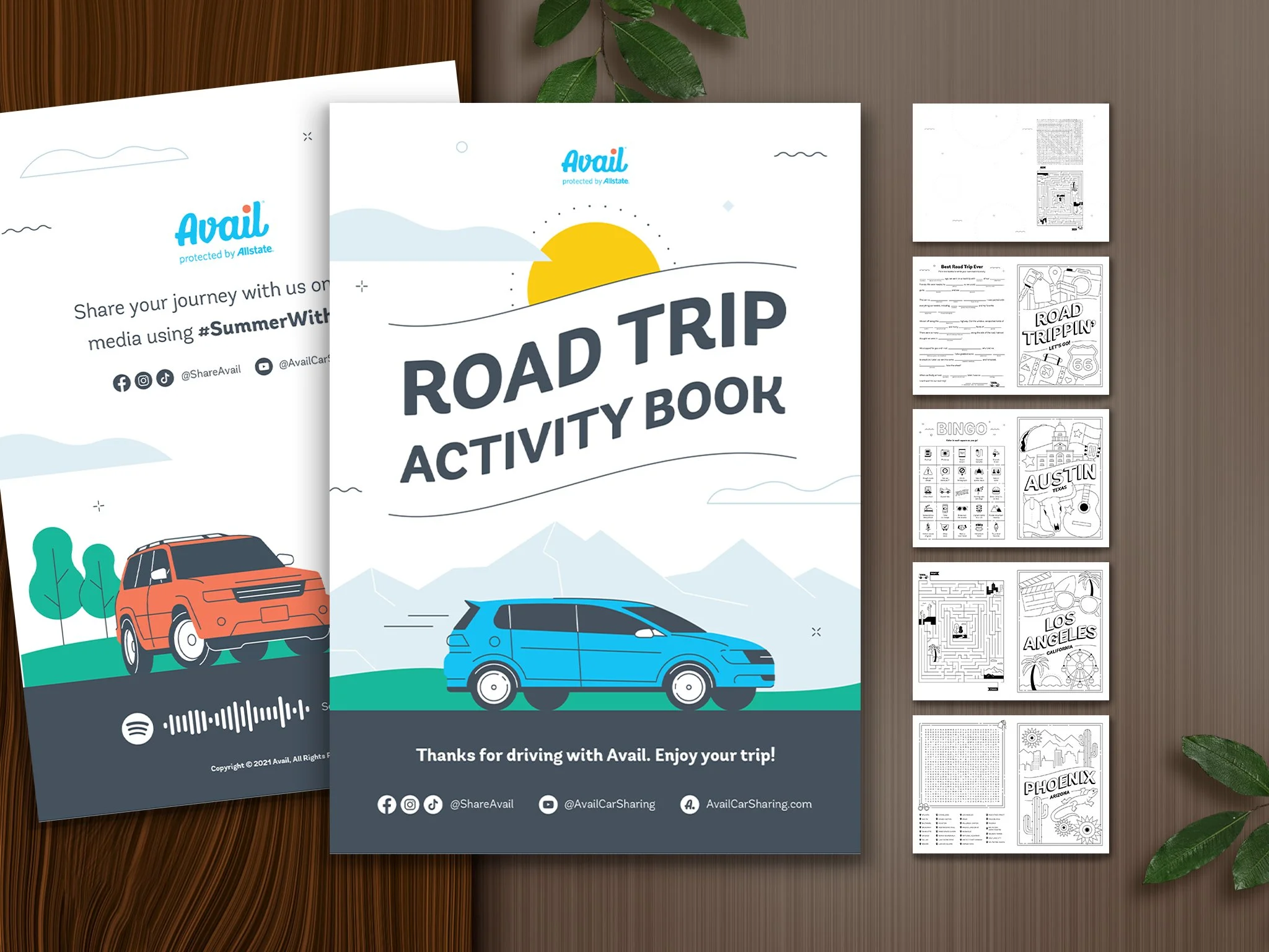
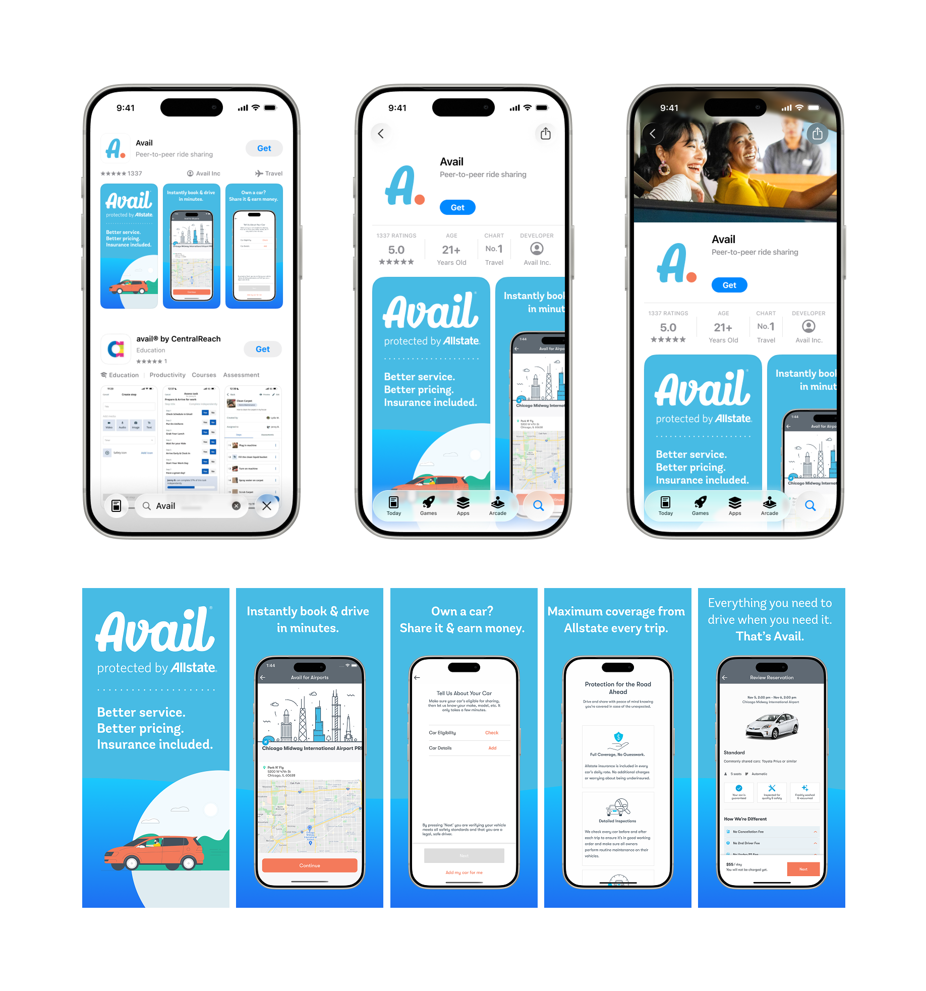
Logo, type, color, and icon working as one — a quick reference for how the pieces combine in product and marketing surfaces.


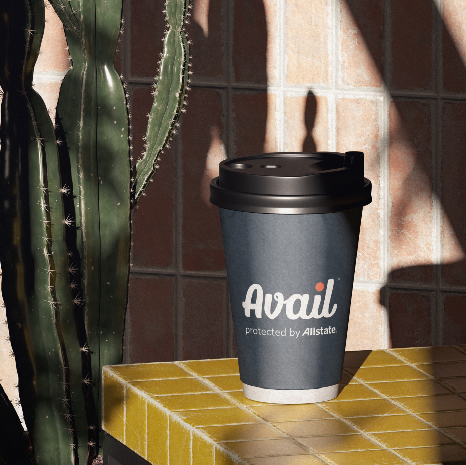
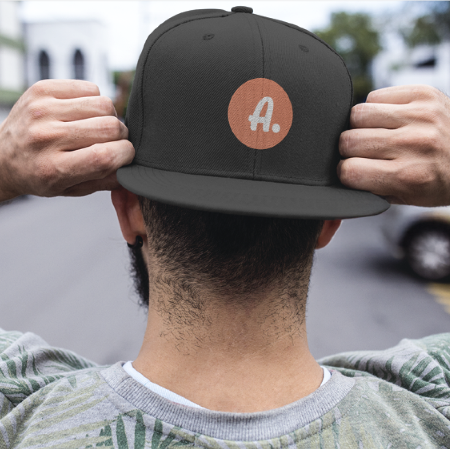

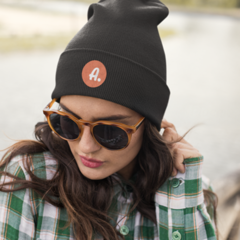



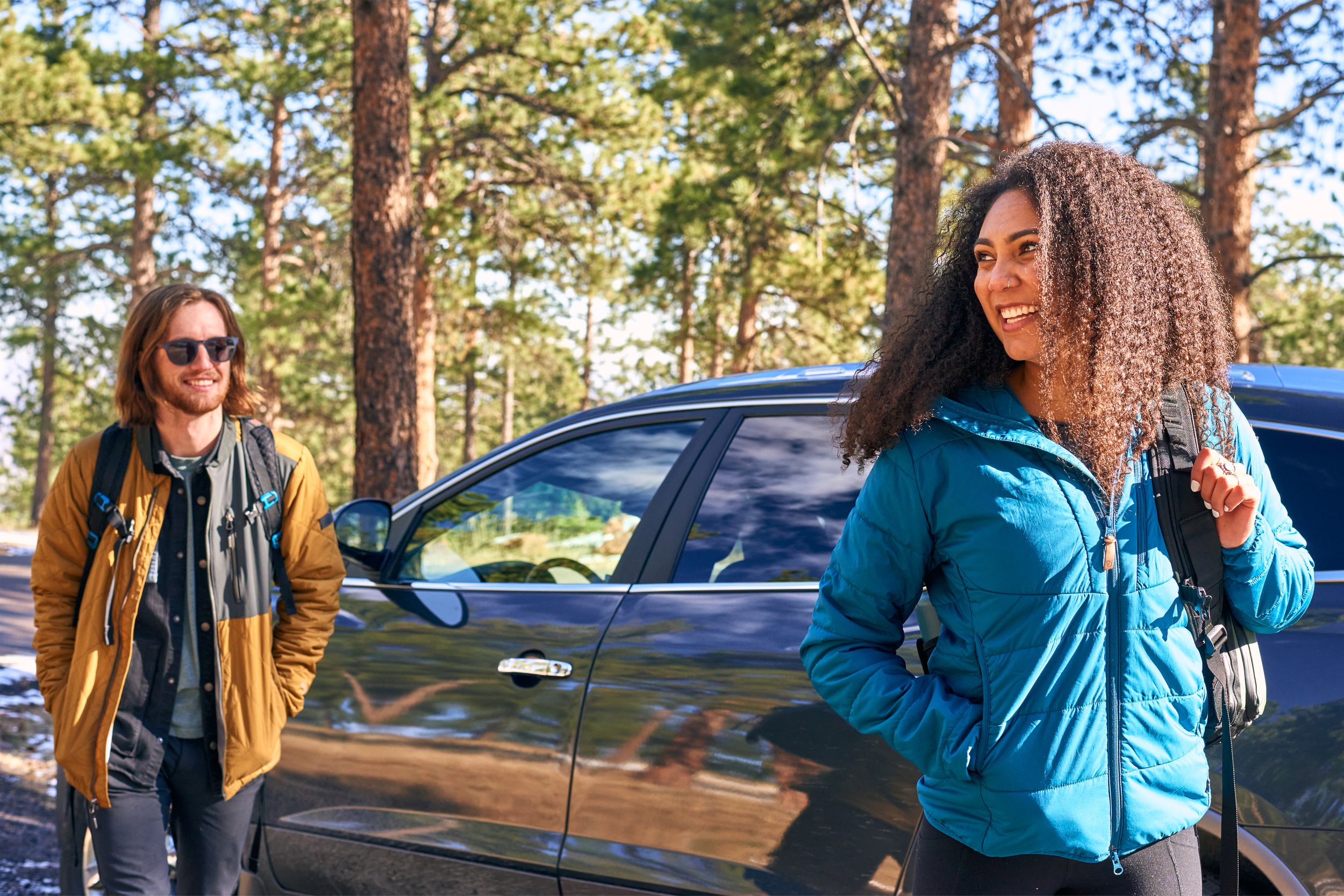
Environments & experiences

THE CONNECTOR
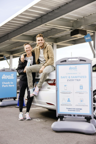
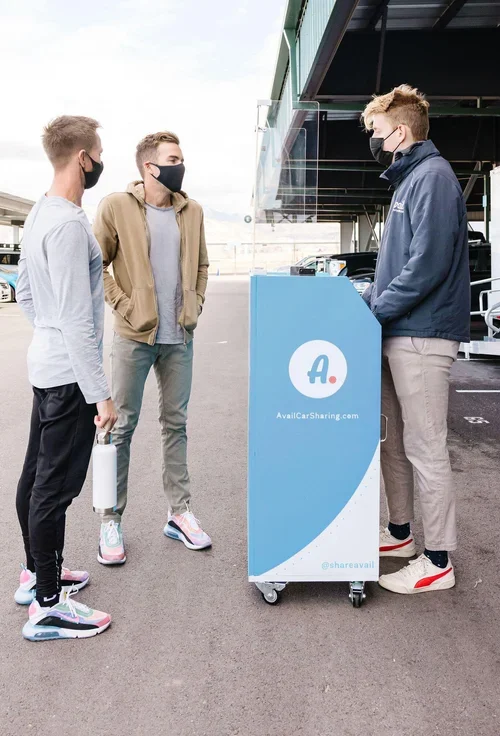
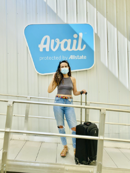
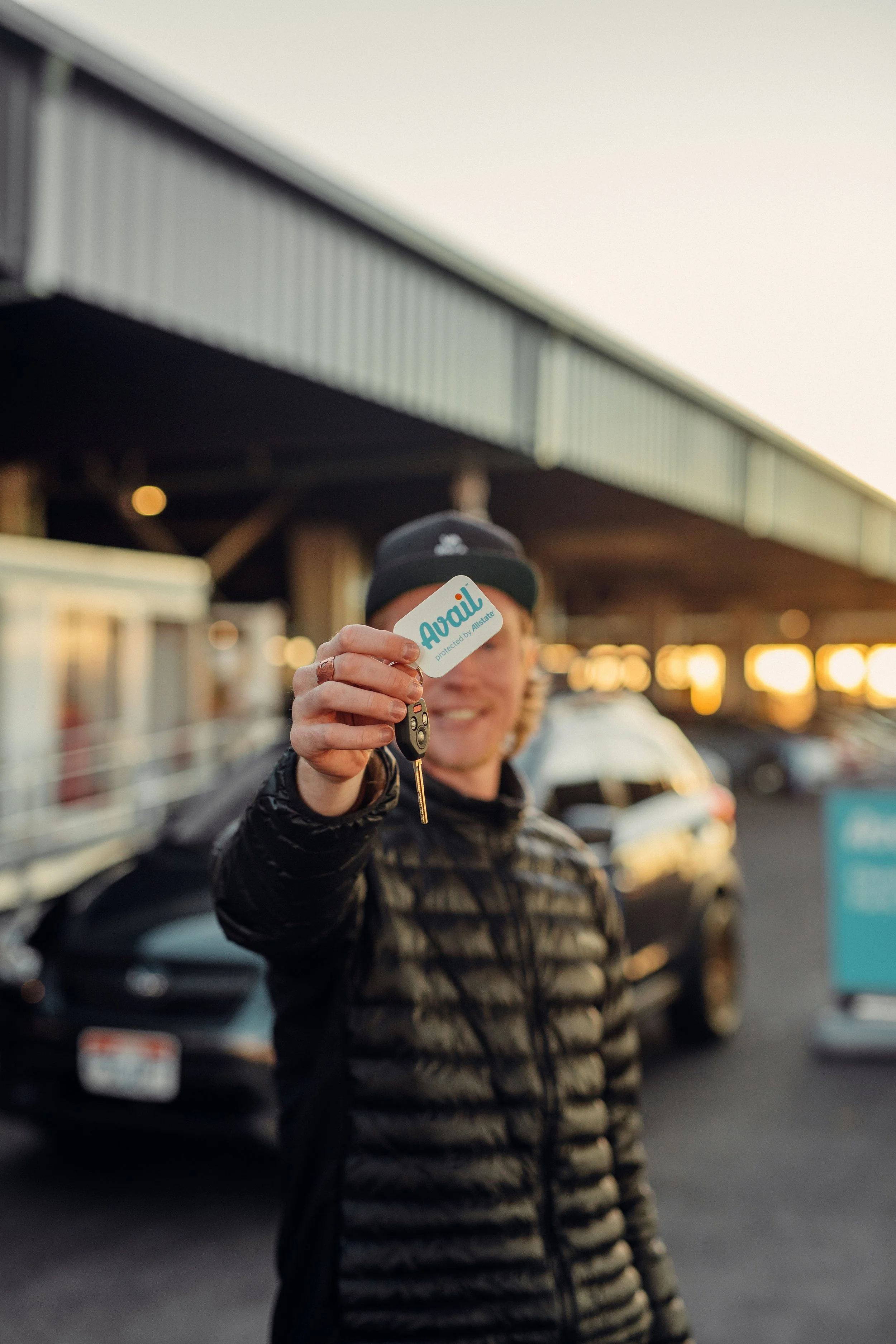
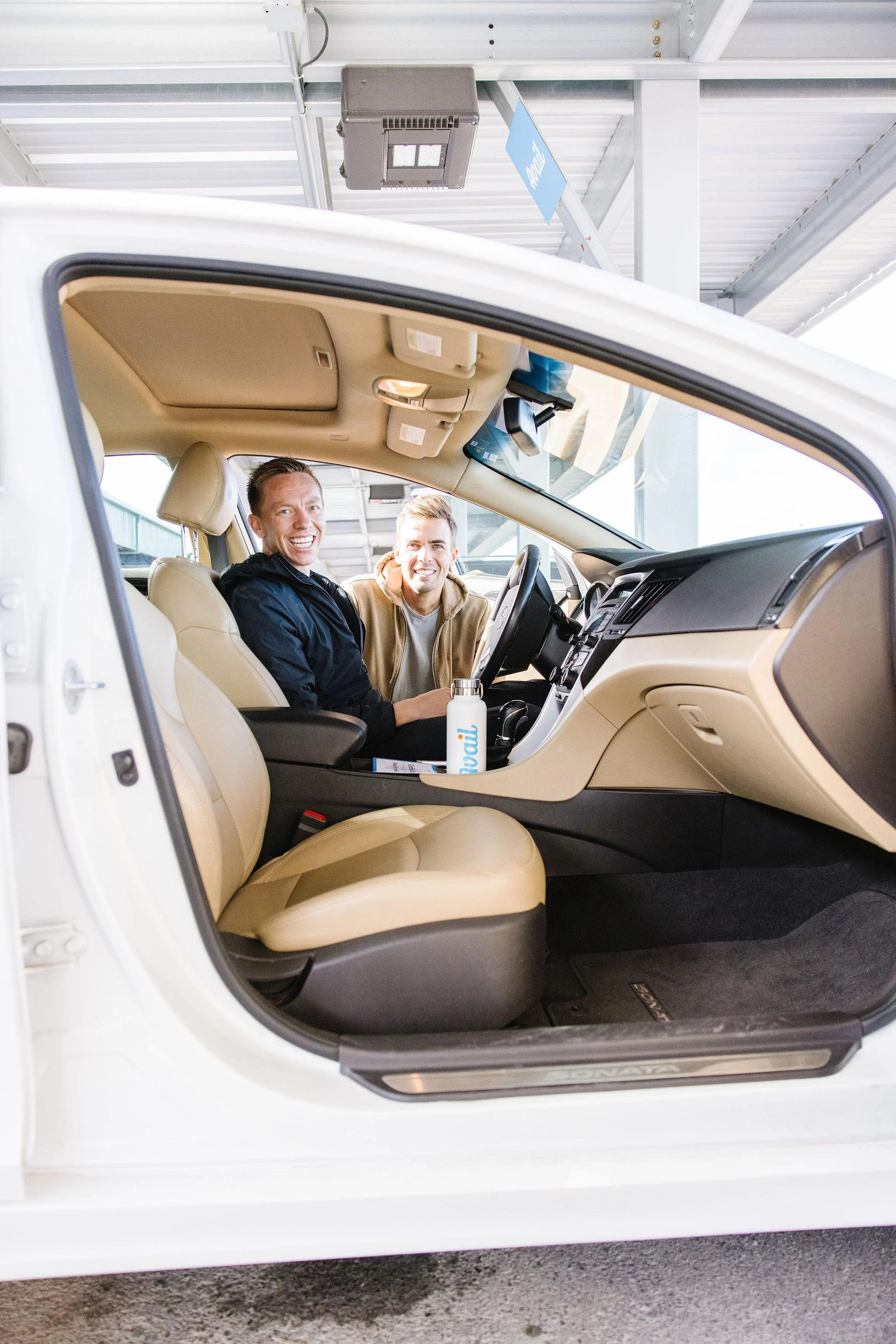
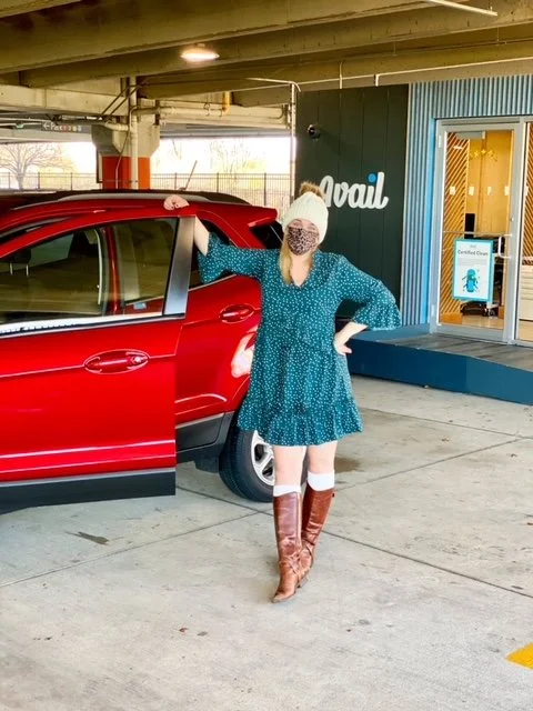
Avail promise’s belonging and build connections through safe, shared transportation that facilitates connections to more people, places and experiences.
Avail pioneers in a new category, humbly venturing out into the world to try something new. Seeking to join local communities to connect customers and learn how to serve them best.
Avail believes in the dignity of every person, and proves it by serving the social good in the communities where we do business.
Avail fight against isolation by bringing people together through a new way to travel and explore.









IMPACT
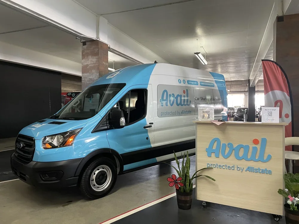
It was incredibly rewarding to contribute to a company whose mission was to redefine vehicle ownership and challenge both legacy rental providers like Enterprise and emerging marketplace platforms like Turo. Building a brand from the ground up was a rare opportunity to shape not just the visual identity, but the entire customer experience.
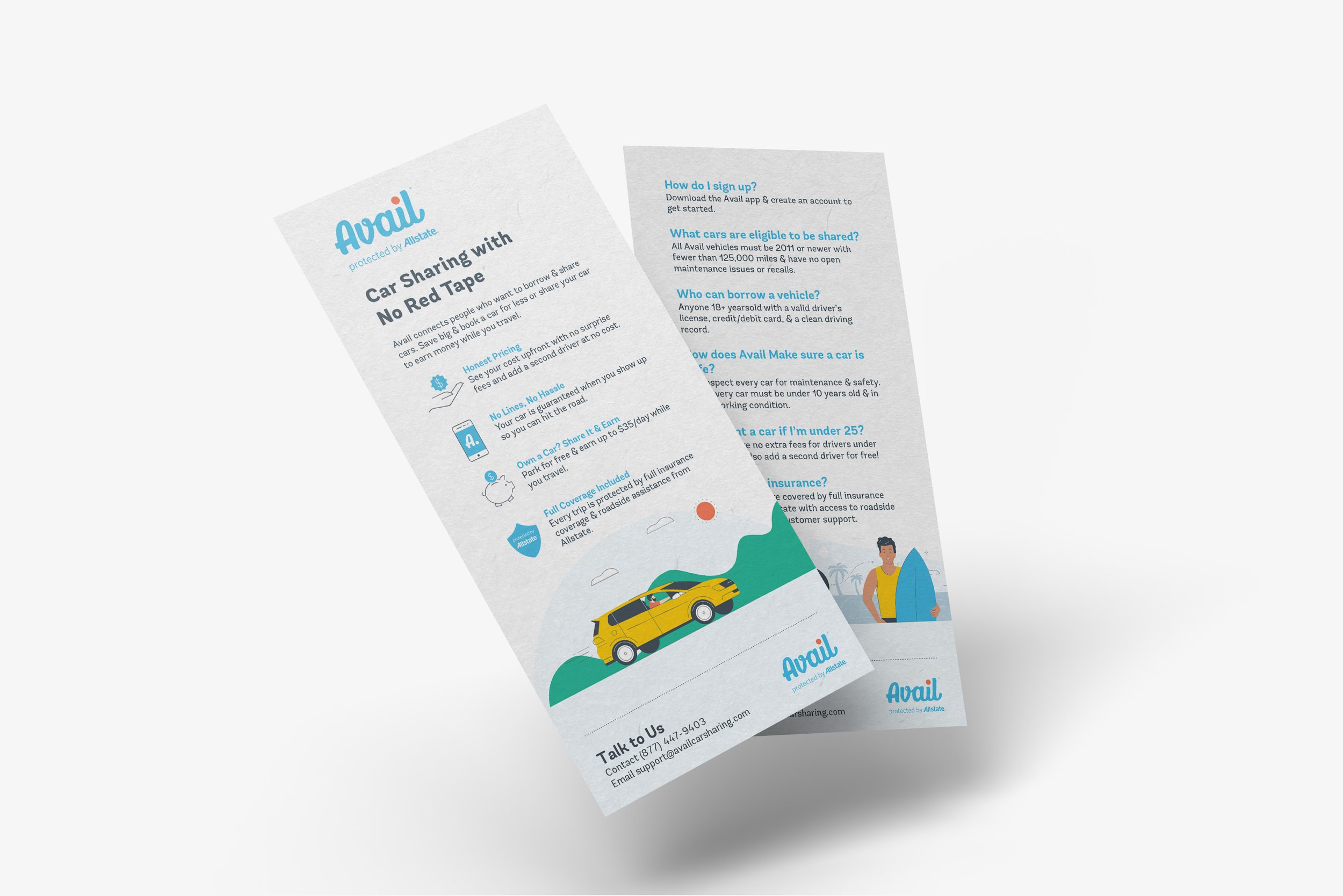
This was a significant undertaking that extended far beyond logo design or marketing collateral. I contributed across nearly every facet of the business, designing cohesive brand experiences that spanned physical environments, digital products, marketing campaigns, onboarding materials, and customer communications. Every touchpoint was intentionally crafted to build trust, reinforce the brand, and create a seamless experience throughout the customer journey.
What made the project especially meaningful was seeing how design influenced both perception and behavior. Our work wasn't simply about creating a recognizable brand; it was about changing how people thought about vehicle ownership and giving them the confidence to embrace a new way of accessing transportation. Being part of that transformation reinforced my belief that thoughtful design has the power to shape not only how people feel about a brand, but also how they interact with it and ultimately change their behavior.